
Friday, April 22, 2011
Los Angeles housing prices
Click on the graph to see the full-size version. The blue line shows nominal housing prices. The red line shows inflation-adjusted housing prices.
Wednesday, April 20, 2011
Is too much debt a bad reason for denying someone a mortgage?
A new CNN Money article titled, "Mortgage denied: Sometimes, for no good reason" claims people are being denied mortgages for bad reasons, but their list of reasons looks pretty good:
Meanwhile, the Federal Reserve has proposed an "ability to repay" requirement for mortgage loans:
- Too few of the condos in your association have been sold
- Your debt is too high
- The wait after foreclosure is extended to seven years from five
- Missed payments on credit card debt
Meanwhile, the Federal Reserve has proposed an "ability to repay" requirement for mortgage loans:
The proposal under Regulation Z would require creditors to determine a consumer’s ability to repay a mortgage before making the loan and establish minimum mortgage underwriting standards.
Zillow.com filed for an IPO
Want to buy a stake in an unprofitable internet company?
Real estate site Zillow.com filed for a $51.75 million initial public offering Monday. ...
Zillow, founded in 2004, provides a database of more than 100 million U.S. homes for sale or rent, as well as homes not currently on the market.
In March, the site and mobile app together attracted 19.4 million unique users — a year-over-year gain of more than 90%.
Zillow's revenue has grown significantly over the past three years, according to the Securities and Exchange Commission filing. In 2010, Zillow's revenue jumped 74% to $30.5 million.
But the company has also booked net losses during that time, though those losses have been steadily narrowing. Zillow only lost $6.8 million last year, compared with $12.9 million in 2009 and $21.1 million in 2008.
Monday, April 18, 2011
Housing bubble graph fail!
I noticed Mark Thoma posting this graph from Barry Ritholtz's blog. Barry Ritholtz attributes it to reader Steve Barry. This graph supposedly shows Robert Shiller's famous 2006 housing graph updated through 2010. Notice that as of December 31, 2010, housing prices are at roughly index value 140, way above the 1989 bubblette peak.
(Click the image to see the full-sized version.)
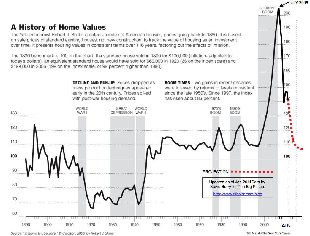
There's just one problem. The graph is bogus. At least it isn't updated with Robert Shiller's national home price data. You see, Robert Shiller updates his own graph (it's in his housing data Excel file) which you can see below. According to Shiller, as of December 31, 2010, housing prices were at index value 124, not 140.
(Click the image to see Robert Shiller's spreadsheet and graph.)

It's possible Steve Barry used the FHFA House Price Index to update the graph, but the S&P/Case-Shiller National Home Price Index is considered way more reliable, and it's the data Robert Shiller uses for home prices from 1987 onward. (Why use one data set for the up side of the bubble and a different data set for the down side?)
I also question how Steve Barry came up with his "projection". It looks like he just drew a dashed line where he wants home prices to go, but that's not valid forecasting.
Update: It appears that Steve Barry is making two errors. First, he is using the S&P/Case-Shiller 20-city index rather than the national index that Robert Shiller used. Second, Robert Shiller's portion of the graph is adjusted for inflation, but Steve Barry's is not. Hat tip to Partisan.
Update #2: I contacted Barry Ritholtz about the issues with the graph. He then contacted Steve Barry. It has been confirmed straight from the horse's mouth, from 2006 onward the disputed graph uses the S&P/Case-Shiller 20-city index, rather than the national index that Robert Shiller used, and it does not adjust for inflation. This graph is really making its way around the web, which is unfortunate because it is worthless.
(Click the image to see the full-sized version.)
There's just one problem. The graph is bogus. At least it isn't updated with Robert Shiller's national home price data. You see, Robert Shiller updates his own graph (it's in his housing data Excel file) which you can see below. According to Shiller, as of December 31, 2010, housing prices were at index value 124, not 140.
(Click the image to see Robert Shiller's spreadsheet and graph.)
It's possible Steve Barry used the FHFA House Price Index to update the graph, but the S&P/Case-Shiller National Home Price Index is considered way more reliable, and it's the data Robert Shiller uses for home prices from 1987 onward. (Why use one data set for the up side of the bubble and a different data set for the down side?)
I also question how Steve Barry came up with his "projection". It looks like he just drew a dashed line where he wants home prices to go, but that's not valid forecasting.
Update: It appears that Steve Barry is making two errors. First, he is using the S&P/Case-Shiller 20-city index rather than the national index that Robert Shiller used. Second, Robert Shiller's portion of the graph is adjusted for inflation, but Steve Barry's is not. Hat tip to Partisan.
Update #2: I contacted Barry Ritholtz about the issues with the graph. He then contacted Steve Barry. It has been confirmed straight from the horse's mouth, from 2006 onward the disputed graph uses the S&P/Case-Shiller 20-city index, rather than the national index that Robert Shiller used, and it does not adjust for inflation. This graph is really making its way around the web, which is unfortunate because it is worthless.
Tuesday, April 12, 2011
Las Vegas housing prices
Click on the graph to see the full-size version. The blue line shows nominal housing prices. The red line shows inflation-adjusted housing prices.

Monday, April 04, 2011
Boston, Massachusetts real housing prices
Click on the graph to see the full-size version. The blue line shows nominal housing prices. The red line shows inflation-adjusted housing prices.

Friday, April 01, 2011
Washington, DC real housing prices
Click the image to see the full-size version. The blue line shows nominal housing prices. The red line shows inflation-adjusted housing prices.

Subscribe to:
Posts (Atom)


