(Click the image to see the full-sized version.)
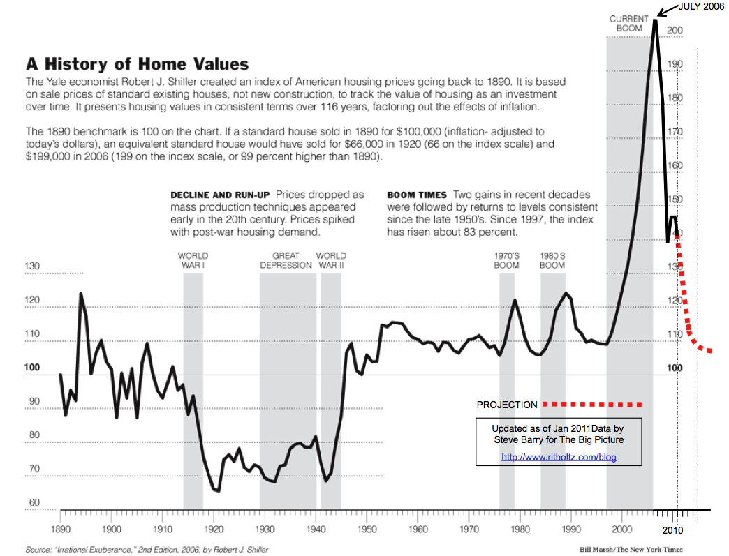
There's just one problem. The graph is bogus. At least it isn't updated with Robert Shiller's national home price data. You see, Robert Shiller updates his own graph (it's in his housing data Excel file) which you can see below. According to Shiller, as of December 31, 2010, housing prices were at index value 124, not 140.
(Click the image to see Robert Shiller's spreadsheet and graph.)

It's possible Steve Barry used the FHFA House Price Index to update the graph, but the S&P/Case-Shiller National Home Price Index is considered way more reliable, and it's the data Robert Shiller uses for home prices from 1987 onward. (Why use one data set for the up side of the bubble and a different data set for the down side?)
I also question how Steve Barry came up with his "projection". It looks like he just drew a dashed line where he wants home prices to go, but that's not valid forecasting.
Update: It appears that Steve Barry is making two errors. First, he is using the S&P/Case-Shiller 20-city index rather than the national index that Robert Shiller used. Second, Robert Shiller's portion of the graph is adjusted for inflation, but Steve Barry's is not. Hat tip to Partisan.
Update #2: I contacted Barry Ritholtz about the issues with the graph. He then contacted Steve Barry. It has been confirmed straight from the horse's mouth, from 2006 onward the disputed graph uses the S&P/Case-Shiller 20-city index, rather than the national index that Robert Shiller used, and it does not adjust for inflation. This graph is really making its way around the web, which is unfortunate because it is worthless.


Hehe, I noticed the projections and wondered about the theory as well. Interesting to note the evolution in the projection if you look at how the graph has changed over time--it's still always a line straight down, even as housing prices were recovering there for a bit.
ReplyDelete"James said...It's possible Steve Barry used the FHFA House Price Index to update the graph"
ReplyDeleteMy guess is Mr. Barry is using case shiller, however he is not adjusting it properly to account for inflation. For example, it looks like his graph still shows the 2006 peak as the nominal CS index value of 206.5. However, over time, that peak should be knocked down, such as in your second (Shiller's) graph where that 2006 peak now, correctly, has a value below 200.
Likewise, See how CS index value is currently at 140? If CS was to continue to post nominal 140 values for months or years on end, sooner or later that nominal 140 will be within the historical 100+ year range on the chart - no nominal price declines necessary.
Still, even if that were to happen, my guess is you would continue to have doomers misusing the chart, constantly drawing a dotted red line down, when in fact inflation made the then current prices very much in line with historic values.
James said...According to Shiller, as of December 31, 2010, housing prices were at index value 124, not 140.
ReplyDeleteI just saw this, and it appears as further proof Steve Barry is not properly adjusting for inflation. The most recent case shiller nominal value for Dec 31, 2010 was a nominal 142.34. I cant open the file here at work, but if Shiller is treating that 142.34 as a value of 124 (as he should), then I think that that is your difference.
Excellent insight. Case-Shiller national is at 130.38, which is what Robert Shiller uses. But, Steve Barry could easily be using the 20-city index which was at 142.34 in December. That would mean that Steve "Dingle" Barry is not only failing to adjust for inflation, but he's also not using the national index that Robert Shiller's graph (post-1987) is based on.
ReplyDeleteIf Partisan is right, Steve Barry must me a 'tard.